Fake Maps
The Places We Didn't Go in 2020
Each year since the invention of flight, two elite teams of ballooning aeronauts circumnavigate the globe, touching back down to earth only for urgent provisions. and sightseeing. In 2020, this grand tradition was halted on account of a PANDEMIC.
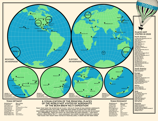
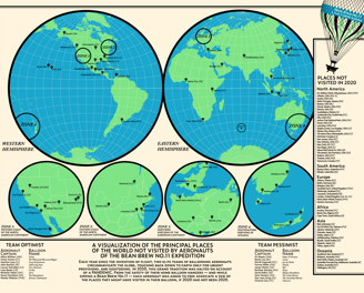
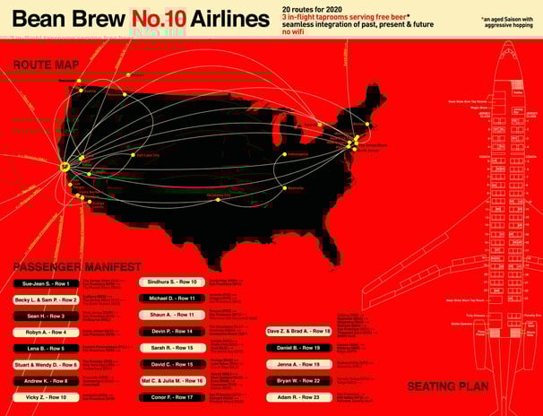
Bean Brew No.10 Airlines
Bean Brew No.10 visualizes an airline route map with flights connecting to the most important locations — past, present, and future — for the brave members of the drinking cohort who stepped onboard the airplane. The beer was a Saison, of course.
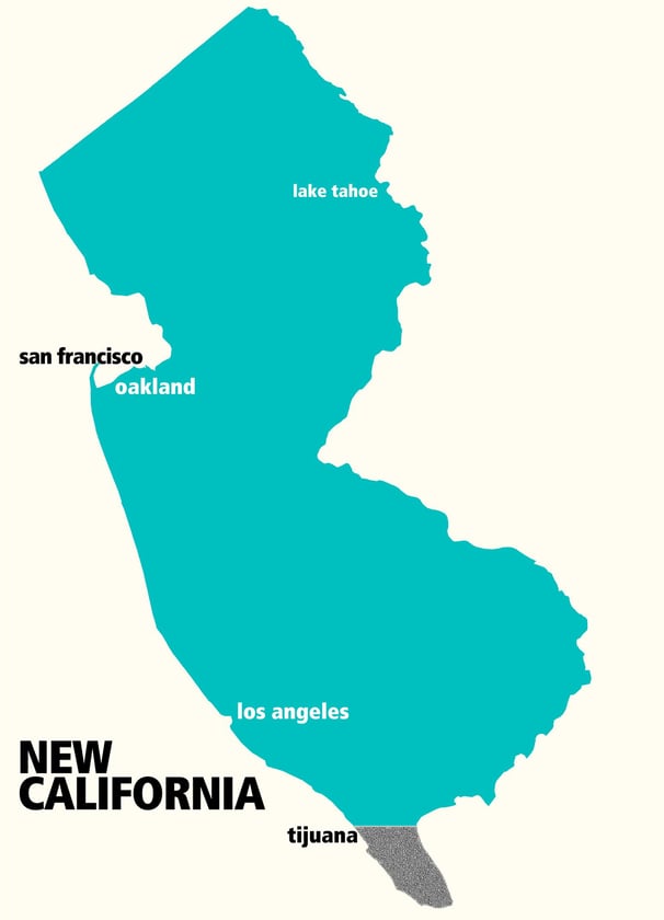
New California
I grew up in New Jersey. Years later, I was lucky enough to move to California. I remember walking through the streets of San Francisco shortly after my arrival and seeing a brightly painted mural that looked instantly familiar.
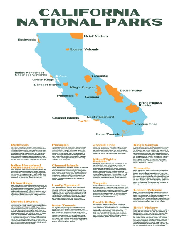
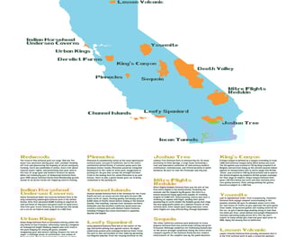
Wait, Is That a National Park?
California has many National Parks. This is good. But let's be honest, having this many National Parks can be just a little bit confusing to keep track off. I set out to design a map that shows the real National Parks. And some National Parks that might just exist, but don’t.
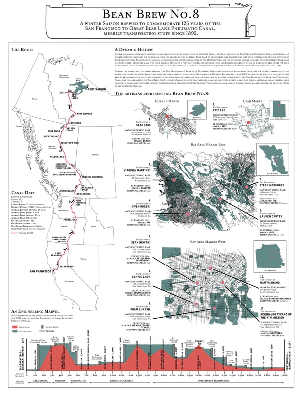
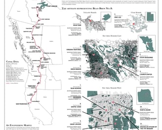
The San Francisco to Great Bear Lake Canal
This map visualizes a fake canal flowing north from San Francisco to the far reaches of northern Canada, as accurately as possible. Created as part of the Bean Brew No.8 experience, the map was distributed to the first actual paying customers of Bean Brew.
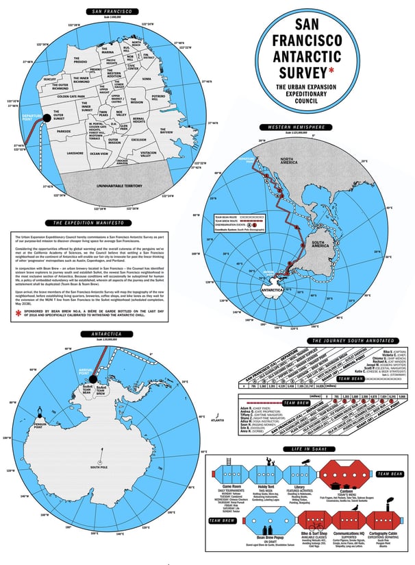
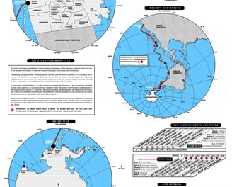
San Francisco Antarctic Survey
This map depicts an expedition from San Francisco to Antarctica in search of reasonably-priced urban living space. Way down south in Antarctica, the expedition team is biding its time with analog hobbies and excellent beer as they wait for the completion of the MUNI subway extension line in 2038.
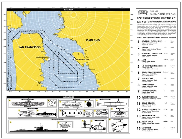
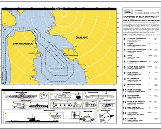
The Great Hunter's Point to Bay Farm Island Submarine Relays
This map contemplates a submarine race from Hunter's Point in San Francisco to Bay Farm Island in Oakland. The 16 submarine captains captured on the poster match the drinking data collected from the 16 Bean Brew patrons who consumed this batch of beer.
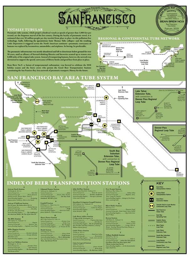
The Great Pneumatic Tube Revival
Pneumatic tube systems, which propel cylindrical vessels at speeds of greater than 1,000 feet per second, are the forgotten marvel of the last century. During the heyday of pneumatic travel, it is estimated that over 50 million people per day traveled from place to place via this pollution-free technology.
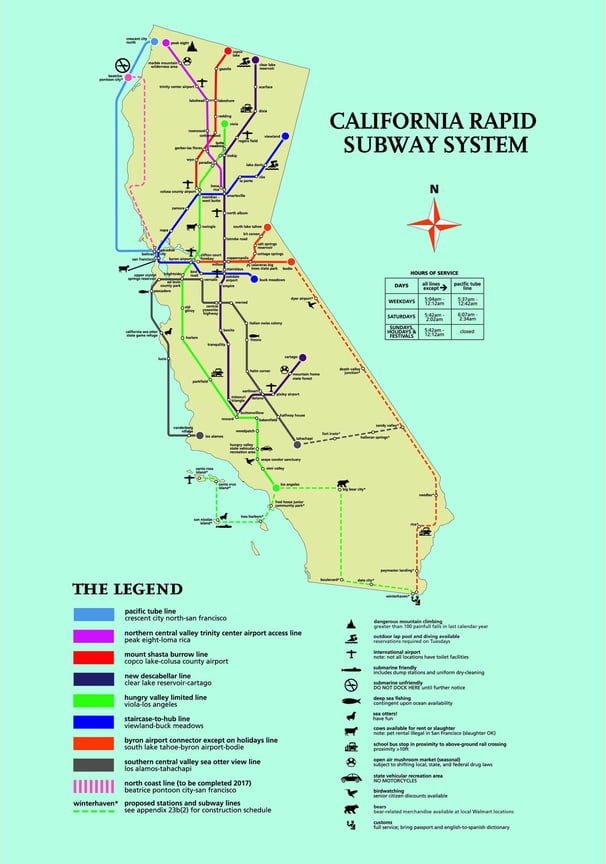
California Rapid Subway System
California is OK at best when it comes to public transportation. But what if we were rockstars and decided to build a subway that connected the far flung cities and towns of the state? And what if that subway system was designed by someone who was perfectly insane? That was basically my design challenge.
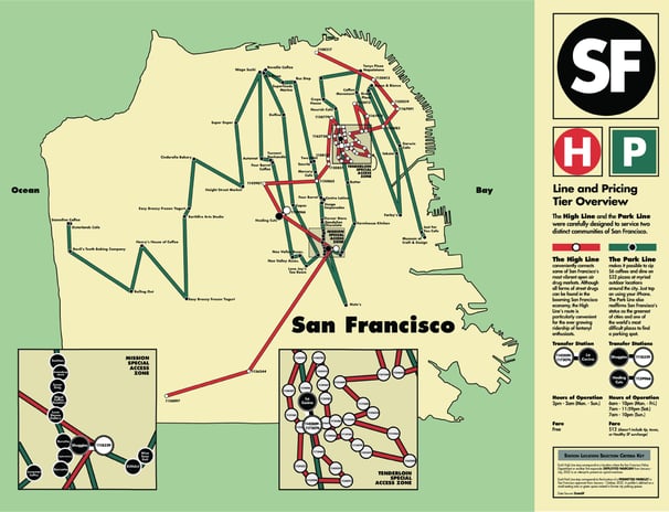
Narcan v. Parklets
Inspired by the West Berlin / East Berlin divided U-Bahn lines prior to the fall of the Berlin Wall, this map envisions two fictional subway lines serving two very divided San Francisco communities.
Each High Line stop corresponds to an actual location where the San Francisco Police Department or another first responder deployed Narcan from January - July, 2022 in an attempt to prevent an opioid overdose.
Each Park Line stop corresponds to the location of a permitted parklet in San Francisco approved from January - October, 2022. A parklet is defined as a small seating area or green space created in former city parking spaces.
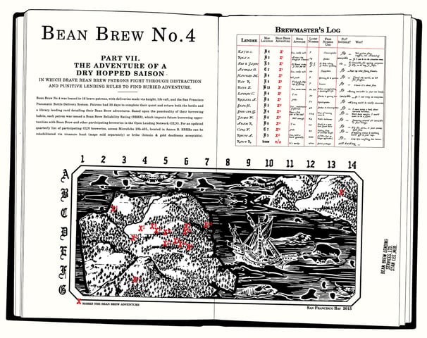
The Adventure of a Dry Hopped Saison
This batch of Bean Brew began with a library card attached to the back of a bottle of beer. Once the drinking data was returned by each of the 16 Bean Brew Patrons, I designed this treasure map which shows the location where each Bean Brew was consumed. I spent an inordinately long amount of time taking a pretty ordinary modern map of San Francisco and turning it into something akin to a 17th Century treasure map.
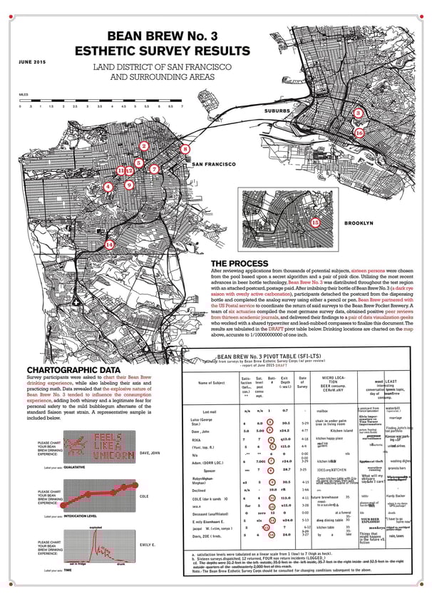
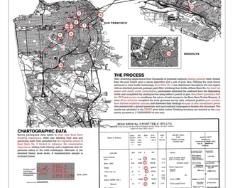
The Esthetic Survey Results
I asked the members of the Bean Brew No.3 cohort to chart their drinking experience, then captured their results with lots of graphs and impenetrable statistical analysis thrown in for good measure. The typography in the data table is intentionally out of alignment, replicating what I hoped seemed like a badly broken typewriter.